top of page
Erik Zimmerman
Dottwav

is a direct-to-consumer music streaming platform focused on independent music. Discover and stream new music from your favorite independent musicians.

Introduction
I first came into contact with Dottwav two weeks after onboarding as the new UX Lead at another startup.
Seeking more opportunities to improve my visual design skills, I met with Davis who was looking for a UI Designer. Him and cofounder Michael Smith aimed to create a more equitable streaming option for independent musicians in the music industry.
Despite a successful MVP launch containing over 150 independent artists and a couple thousand songs, they were unsatisfied with the designs and brought me on board to enhance the visual appeal while development worked out a few bugs.
My role also involved building a design system for accurate design implementation and expanding on the web-based artist portal.

Before
Album Page

After
Album Page
Goal
Starting this project, my goal was to enhance my UI skills by thoroughly understanding Apple's design system and applying it to the next iteration of Dottwav.
While given some direction on type and color, there was no clear logic in design construction. My primary focus was to create a component-based system for cohesive and visually appealing UI, ensuring logical spacing and consistent element placement.
I have to say I was thrilled to be working on a content driven app with such a cool concept. I could also tell from first impression that I would need to work on the browser based artist portal. At the time, it was not responsive and completely unusable on mobile devices.
Product Vision
Davis aimed to prioritize artists in the app by incorporating features to grow their following. The app is native to iOS and should follow the general logic of Apple’s design system.
There were also features that were omitted in the MVP that needed to be implemented in this iteration, such as a search flow and user-created playlists.
The design direction drew inspiration from Apple Music, Spotify, and stakeholder insights, blending the best elements into Dottwav—a unique music streaming platform that ensures equal payment to artists per stream.
Design System - Type
I documented existing text styles, collaborating with Davis to establish a type scale for the mobile app and artist portal.
In the MVP, there was misuse of the SF Pro Display typeface; we clarified when to switch between "Pro" and "Pro Display" families.
After creating the scale, I tagged each style for future use in component guides. While I initially believed this concluded the text discussion, additional styles emerged before the project's completion.

SF Pro Display
Display family is used for text equal to or larger than 20px

SF Pro
Pro family is used for text smaller than 20px

Design System - Icon & Color
Icon
The MVP suffered from inconsistent icon styles. To address this, I constructed a library utilizing SF symbols wherever possible and incorporating similar icons from other sources when necessary.
As my focus shifted from revamping old screens to crafting new ones, this library doubled in size.
Color
Davis had decided on keeping the app in dark-mode only. The most significant difference is the brand color, changing from saturated blue to an electric yellow.
Gradients on content pages derive colors from the cover image.


Design System - Nav Bar Component
Davis felt the previous design of the navigation bar took up too much space on the screen. The first decision was to drop the supporting text and to use a darker, solid fill to reduce visual clutter.
After testing multiple iterations, we finalized the design. As the app embraced its social aspect, incorporating a profile section into the bar became essential.


Nav Bar Component Annotation
-
Box Fill: #050505
-
Icon Size: 26 x 26 px
-
Inactive Icon: Stroke, #828282
-
Active Icon: Fill, #FFFFFF
-
Dimensions: 414 x 86 px
-
Icon is centered in it's own square 1/4 the width of screen. Touch target 48 x 48 px
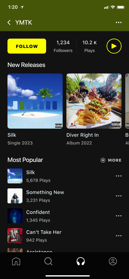
Designing the Artist Page
Prioritizing the artist in the Dottwav MVP update necessitated a focus on enhancing the artist profile—the crucial screen for building their following.
Facing constraints, I crafted a design featuring a full-screen cover image, artist name, a primary follow CTA, popularity indication, new releases, and a top-five streamed songs list with discography access.
I defined when the artist name collapses into a navigation bar to avoid overlap with floating page controls on the cover image. Scrolling triggers a fade-in of a solid-colored box with a smaller name upon eclipsing the chevron, completing the animation when the content section reaches the bottom of the faded-in rectangle.


Building the Artist Page
To aid with development, I created a design system of components to use as building blocks in various pages throughout the app. In the wireframe to the left each component is separated by a spacing indicator.
The goal was to create a consistent logic of spacing between sections on every screen while allowing the developers to focus on creating the reusable components.
I went about creating annotated guides for each component while communicating with development to ensure the designs and interactions translated accurately.
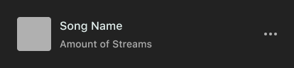

Popular Song Component - Annotated Guide
Text and spacing labels were used along with annotations to visually communicate how components should be constructed. Explanations of the subtle differences in their variations and called out how to handle edge cases.

-
Floats on background. Variants show how component changes when the song is played - color - #FAFF00, equalizer animation plays. EQ base aligned to base of text
-
Song Name text - #E3F0EE. Stream amount just shows the number, text and icon fill - #B0B0B0
-
Note how text box width changes based on if song is playing (264 - 248 px)
-
Floating Component Dimensions - 366 x 48 px
Updating the Home Page
This is the space for sharing promoted content with users. While the current version lacks a user preference algorithm, future iterations may include it. I suggested adding genre preferences during onboarding for more relevant recommendations.
The page's content will be periodically managed and updated, enabling paid promotion and the discovery of otherwise overlooked content.

Finishing the Mobile App
I finished updating every page of the Dottwav MVP and created new flows for playlist management and searching for content. Every component was documented and the design system for the mobile app was complete.
While development worked on building core components, a UX researcher was brought on to test and validate the usability of the new features.
Artist Portal
I turned my attention to the web based artist portal where musicians upload their content, collect earnings, and track statistics from the mobile app.
I updated every page of the website using the design system that I’d established for mobile app while also defining the responsiveness from desktop to mobile.
Artist Portal - Home Page
I interviewed Davis, an experienced musician with a history of uploading on various platforms. Based on his insight, I initially designed for a medium viewport size (1512 px), considering the common use case on laptops.
I sought to adapt the design language from the mobile app to the website for consistent branding. This was especially challenging when designing new components such as data visualizations to track streams, likes, followers, and demographics of listeners.
We thought about tracking stats by song or album, but ultimately saved this for later versions.
.png)
Responsive Design
I first focused on how content fits at Desktop Medium to ensure the experience on laptops was seamless. Bento box containers are arranged in a two-column layout until tablet size where it collapses into a single column.
I then determined the navigation bar would collapse into a hamburger menu at 960 pixels because of the necessary space to maintain two columns down to tablet size.
1920 - Desktop Full
1512 - Desktop Medium
1280 - Desktop Small
960 - Nav Collapse
768 - Tablet
375 - Mobile


Upload Album Flow ( I - IV )
Success meant balancing page controls with user expectations while parsing out the cognitive load of 20+ inputs. Recognizing that album uploading is quite different from uploading a single track, I suggested using two buttons to separate the flows.
Songs uploaded in an album inherit the cover and genre while featured artists and explicit indication have to be managed on a track-by-track basis. I aimed to design a solution that didn’t rely on modals for individual track management
I - Add Album Info
II - Manage Tracks
III - Schedule Publish
IV - Review


Want to see more?
Update Release
In mid-December, the latest version of Dottwav hit the Apple store and I eagerly downloaded it to see how my work came to fruition.
I was delighted to observe my designs reaching the public, and had little criticism about how the final product looked.
Although the user playlist and profile features are still in progress, the rest of the implementation was remarkably close to perfection. I'm confident that the design system I crafted played a crucial role in this success.
Final Thoughts
My tenure at Dottwav underscored the importance of seamless communication with developers and stakeholders, enhanced my grasp of creating straightforward yet visually stunning UI, and imparted valuable lessons in designing for swift development.
I especially enjoyed designing the components and assembling them like puzzle pieces on the page. The challenge of creating detailed component annotations and page spacing guides, coupled with engaging discussions with the development team to troubleshoot any issues, was particularly gratifying.
“Erik's not just a great designer; what really sets him apart is his communication skills and meticulousness. I'd definitely recommend him to anyone.”
Davis Brown, Dottwav CEO
bottom of page